
The majority of visits to a typical local business website now come from a phone, often over a patchy mobile connection, often one-handed, often while the person is doing something else. Yet almost every site is designed and approved on a 27-inch monitor in a quiet room.
That mismatch is where enquiries leak away.
Mobile-first is a sequence, not a screen size
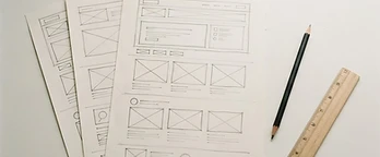
Designing mobile-first means deciding what earns its place when you only have a narrow column, then adding as the screen grows. Designing desktop-first means cramming a wide layout into a narrow one and hoping. The second approach is why so many sites have a phone version that feels like a compromise.
The rules that actually matter on a phone
Tap targets. Anything tappable needs to be at least 44 by 44 pixels with space around it. Two links side by side in body text will be mis-tapped constantly.
The thumb zone. The bottom third of the screen is the comfortable reach. That is where your primary action belongs, not stranded at the top behind a menu.
Type size. 16px minimum for body text. Anything smaller triggers zooming, and zooming breaks your layout in ways you never tested.
One column, one idea. Side-by-side content almost never survives the transition. Stack it and cut it.
Forms. Correct input types so the right keyboard appears. Email fields that open a numeric keypad lose people instantly.
What to cut, not shrink
The instinct is to shrink everything. The better instinct is to remove. On a phone, a visitor is scanning for one thing. Every extra section between them and the answer is a chance to leave. Long hero paragraphs, decorative carousels, three-column feature grids and social feeds are usually the first to go.
Performance is a design decision
A beautiful mobile design that takes six seconds to appear is a bad mobile design. Large hero images, multiple web fonts, video backgrounds and third-party scripts are the usual culprits. Compress images properly, serve modern formats, load fonts efficiently, and be ruthless about scripts you do not need.
Test like a real user
Not the browser's device simulator. An actual mid-range phone, on mobile data, outdoors, one-handed, in bright light. Then ask someone who has never seen the site to find your phone number and book a job. Watch where they hesitate. That hesitation is your roadmap.
The short version
Design the phone view first, put the action within thumb reach, keep text readable without zooming, and make it fast on a cheap handset. Get those four right and the desktop version tends to look after itself.